The project set in motion a research, analysis, and strategy period that ended up covering all the companies that offer different services in the cultural promotion industry. This led to the definition of a brand concept evolved from its core value.
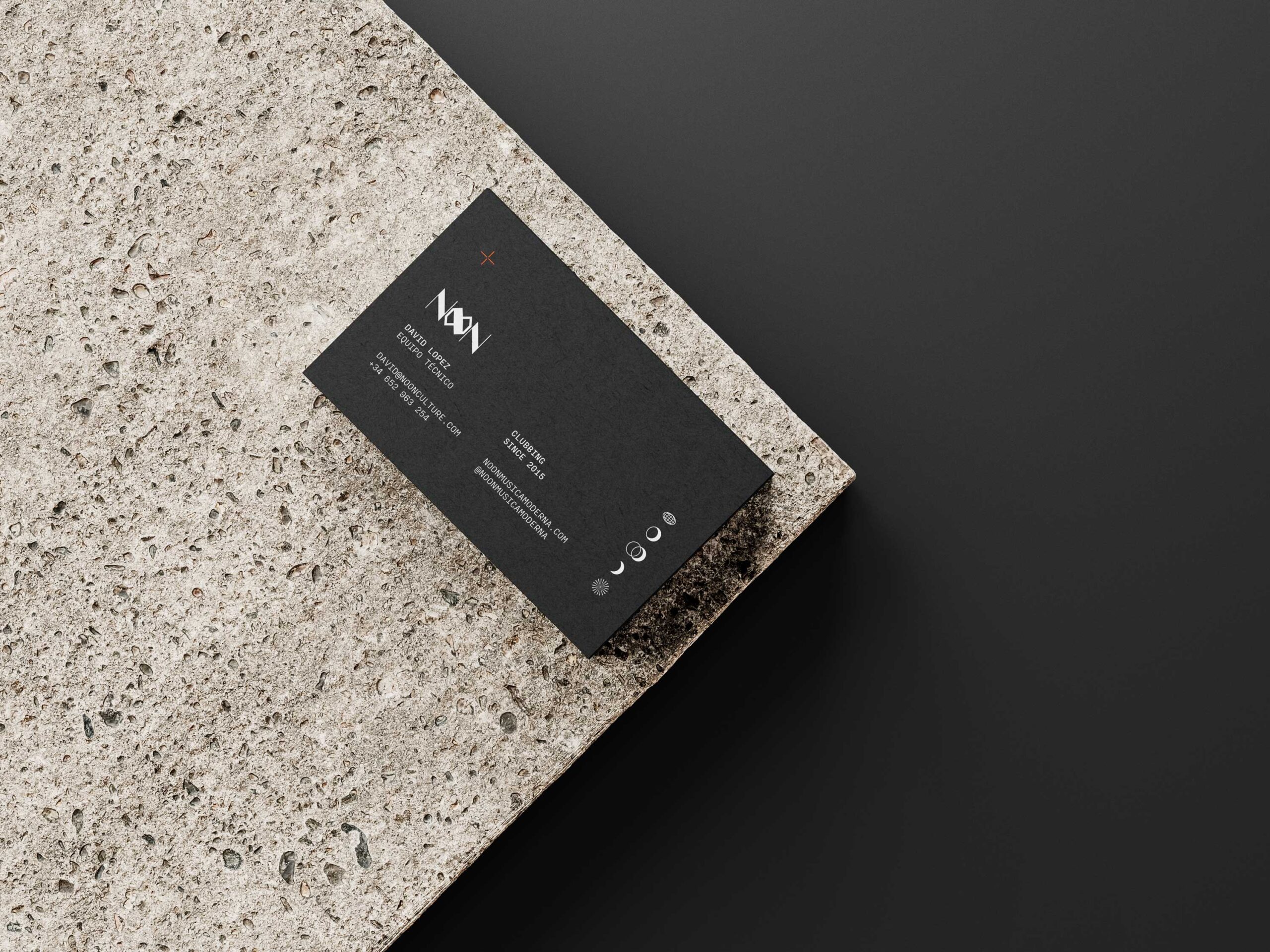
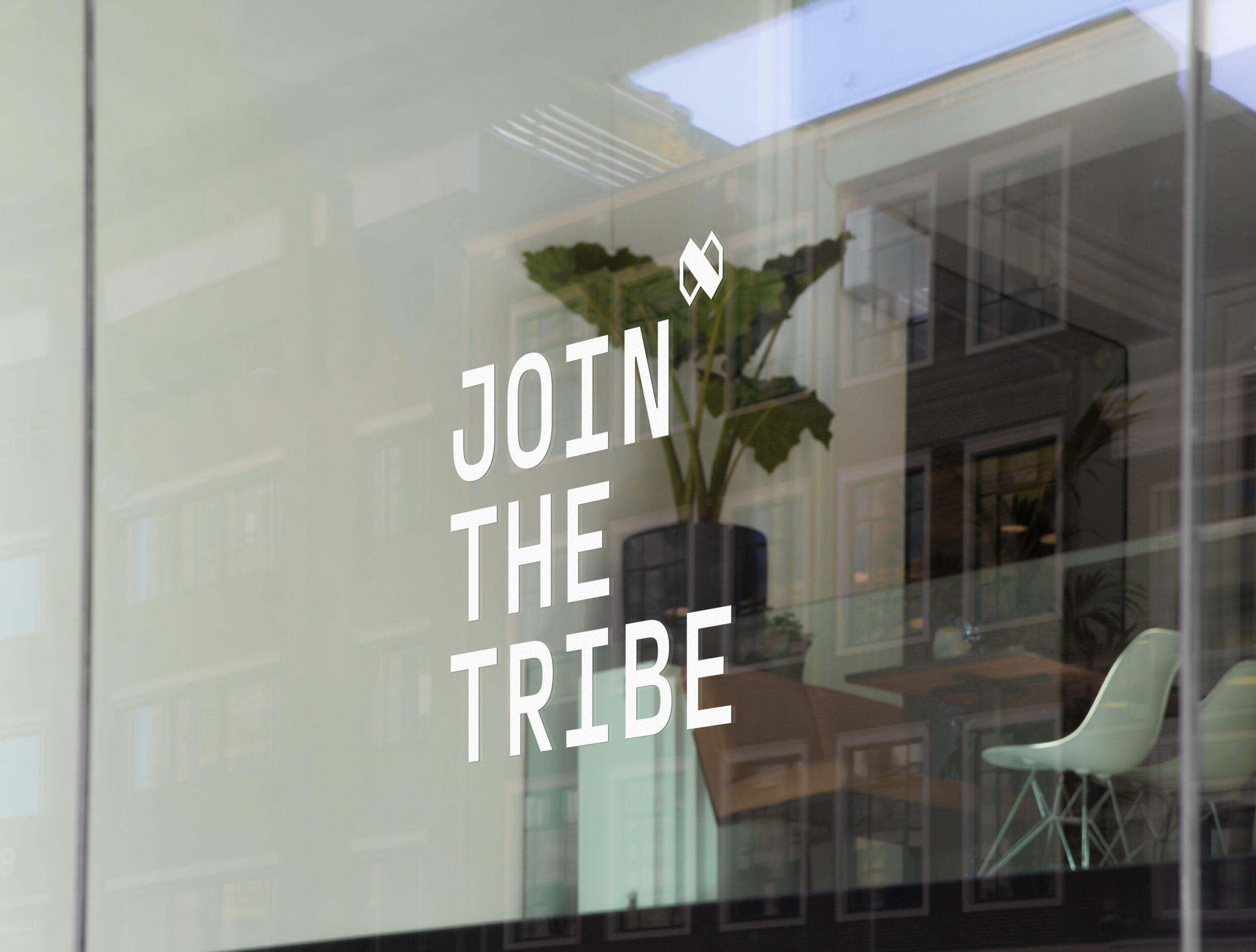
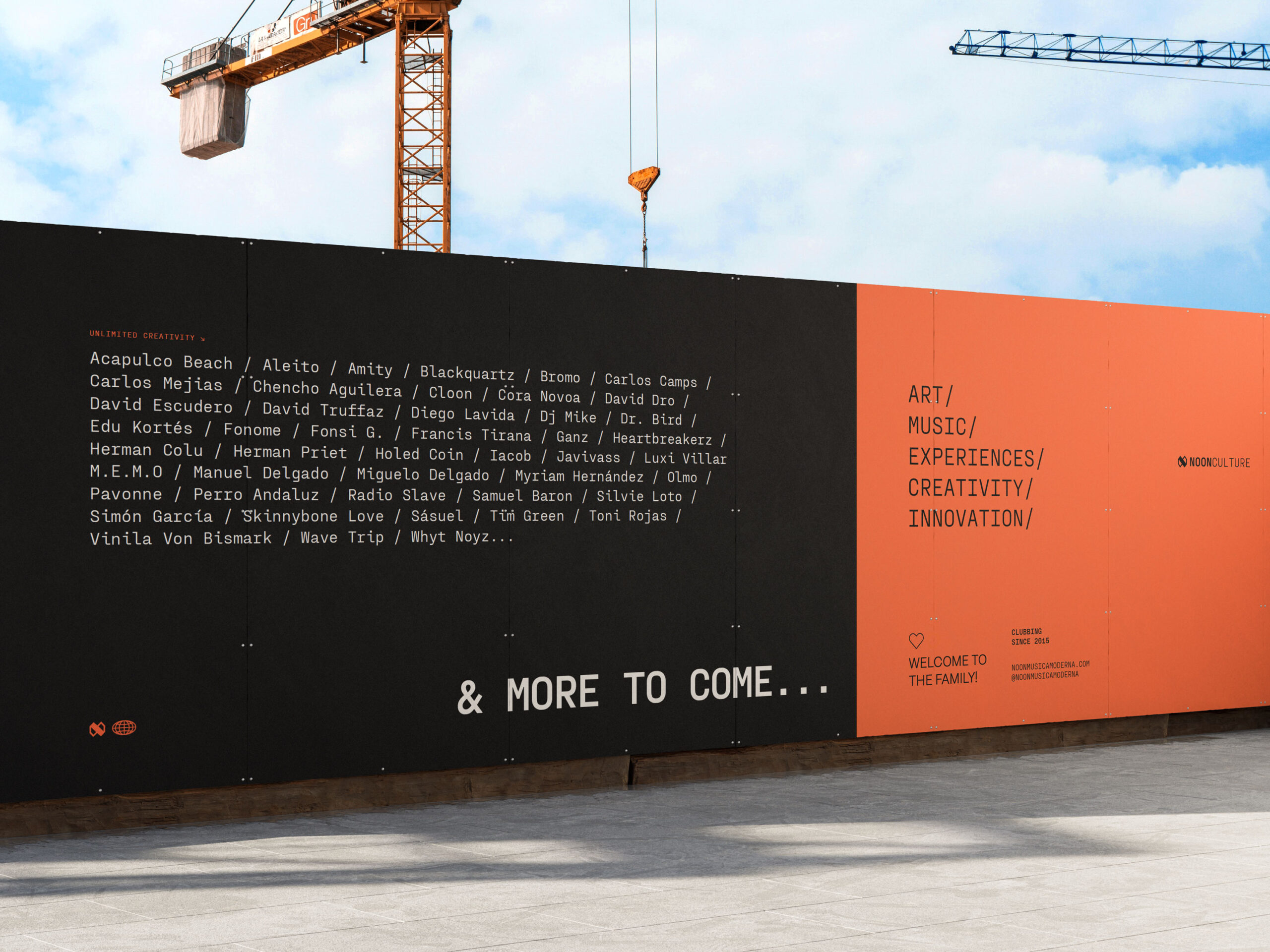
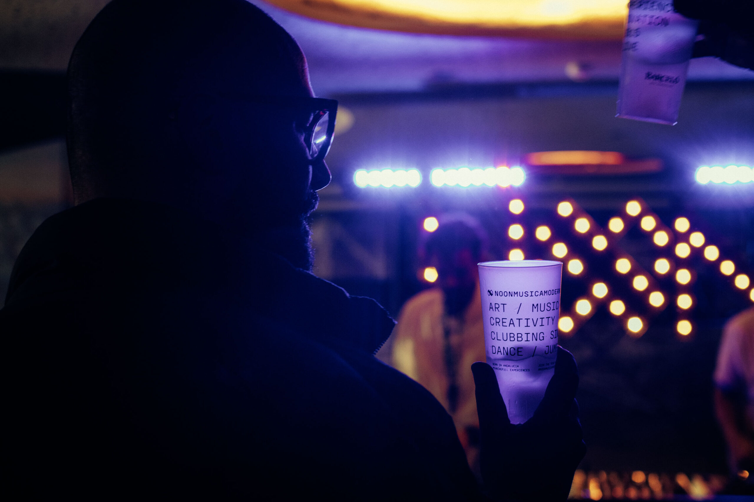
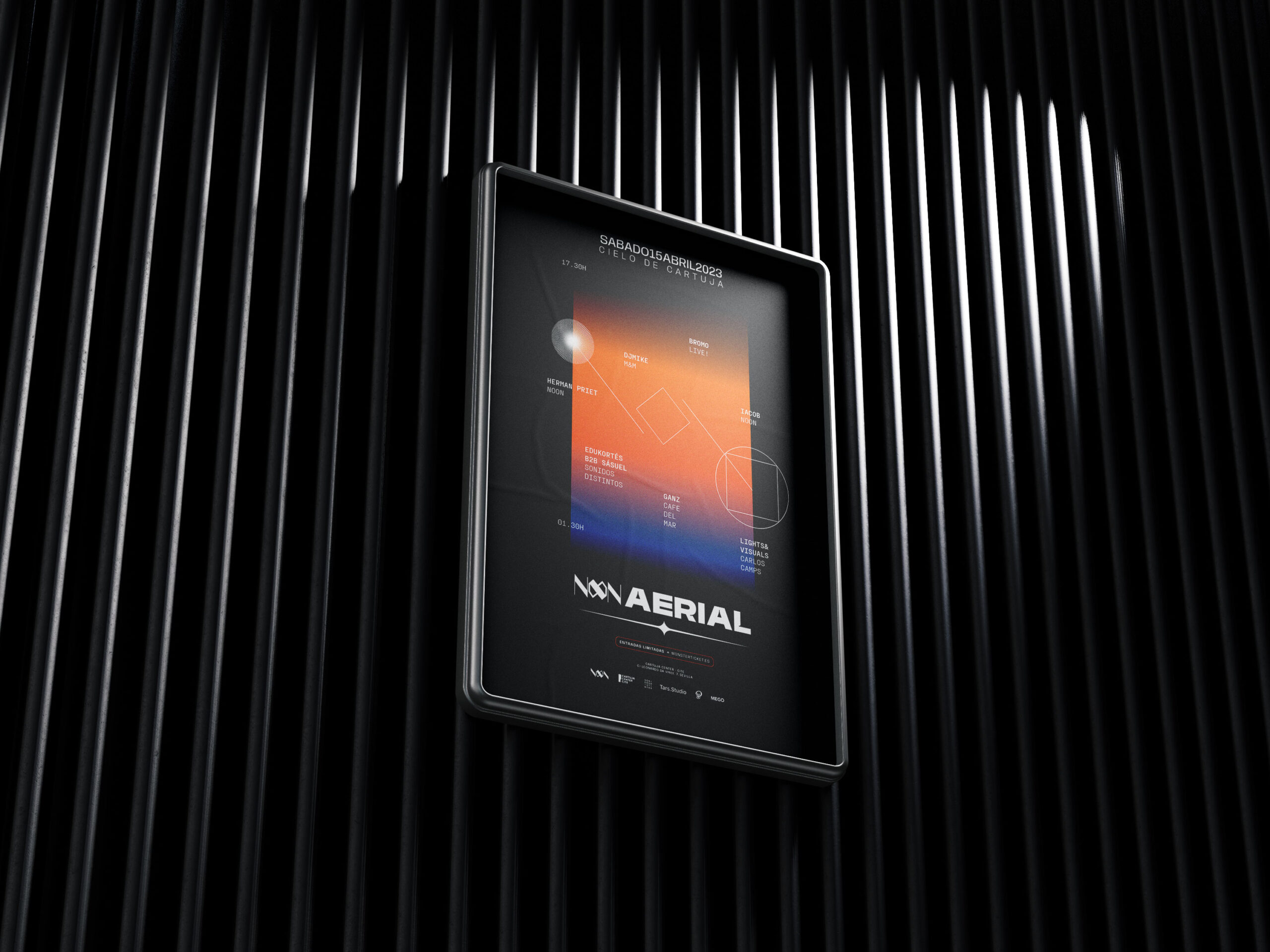
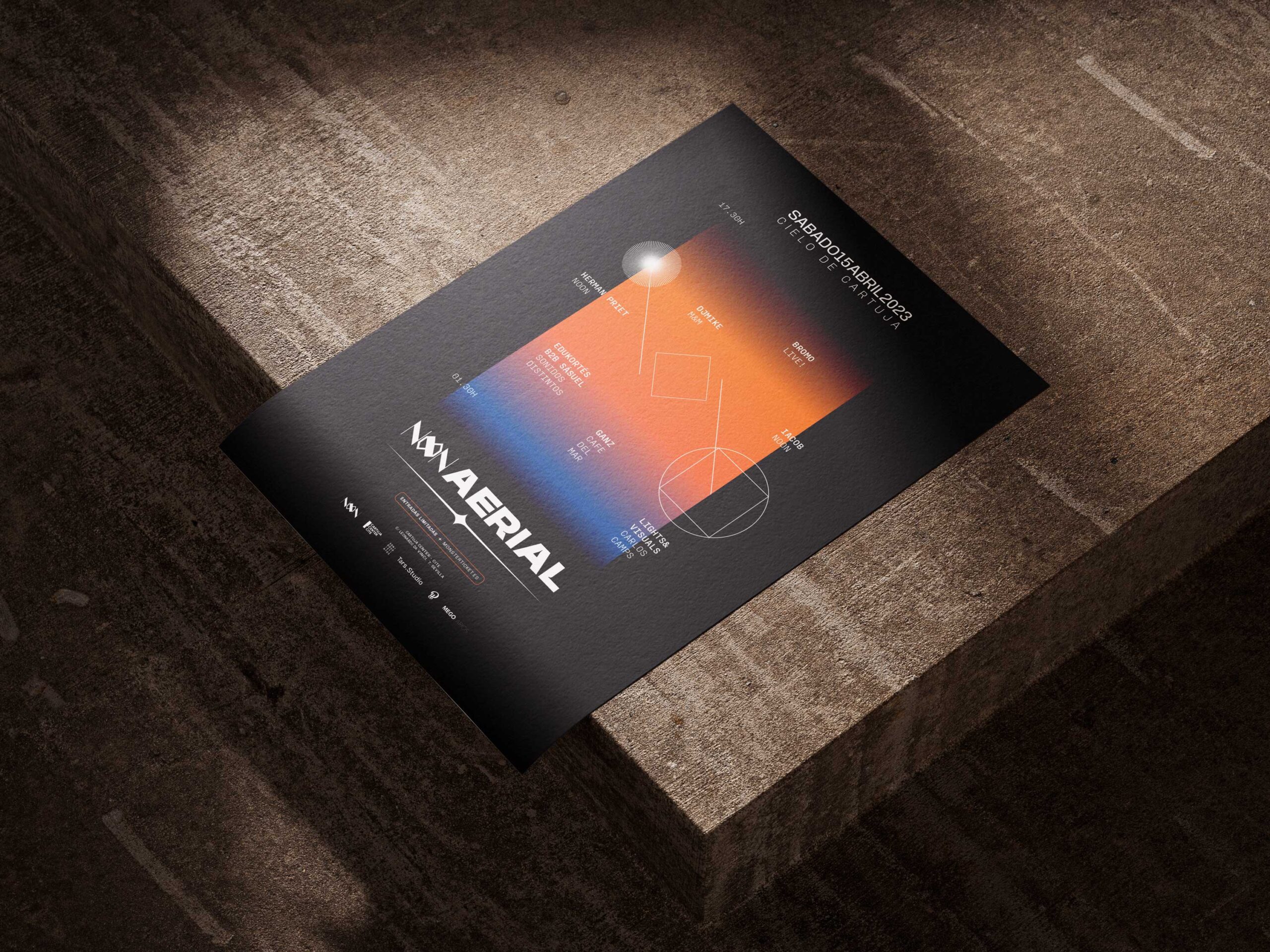
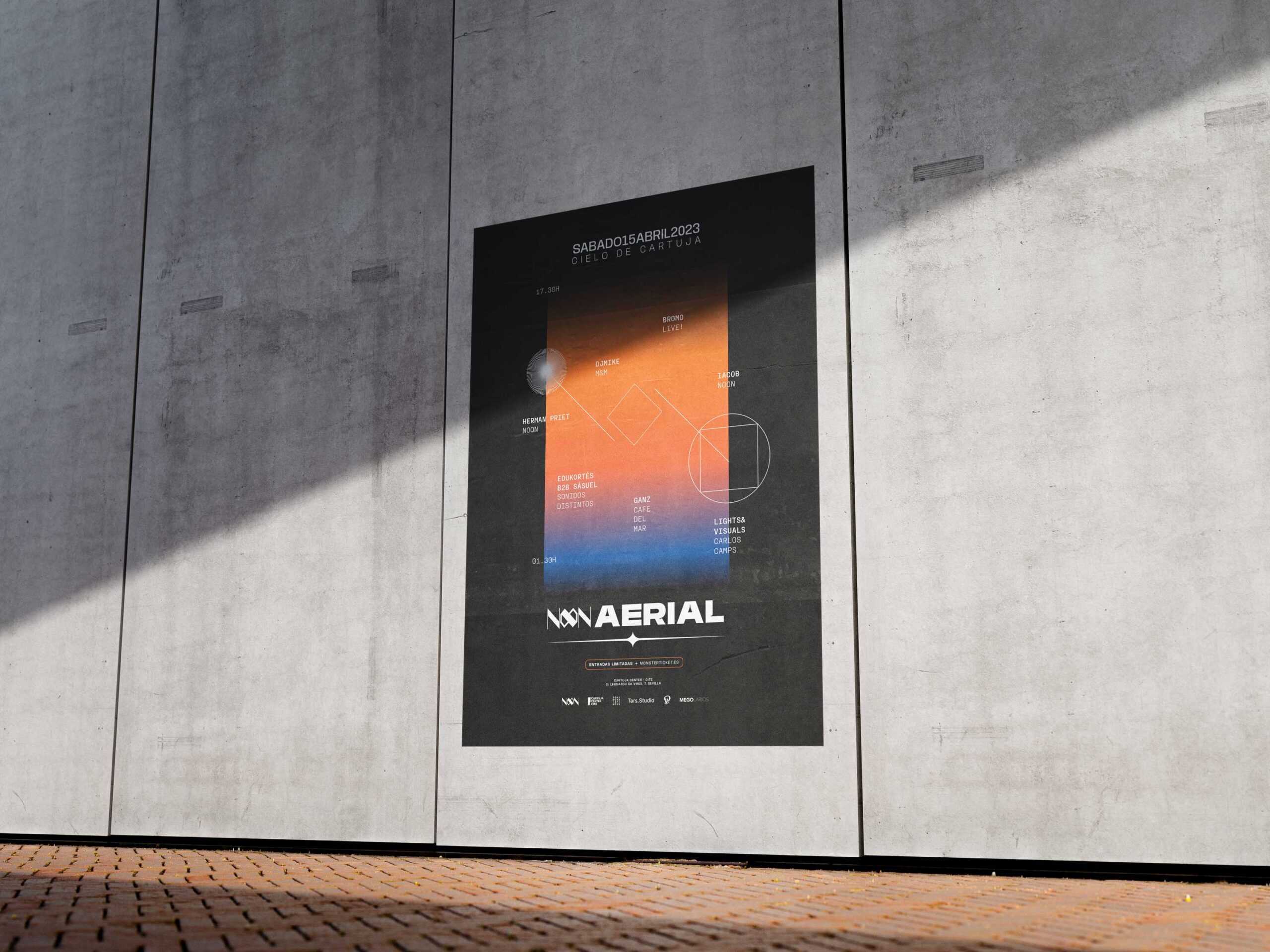
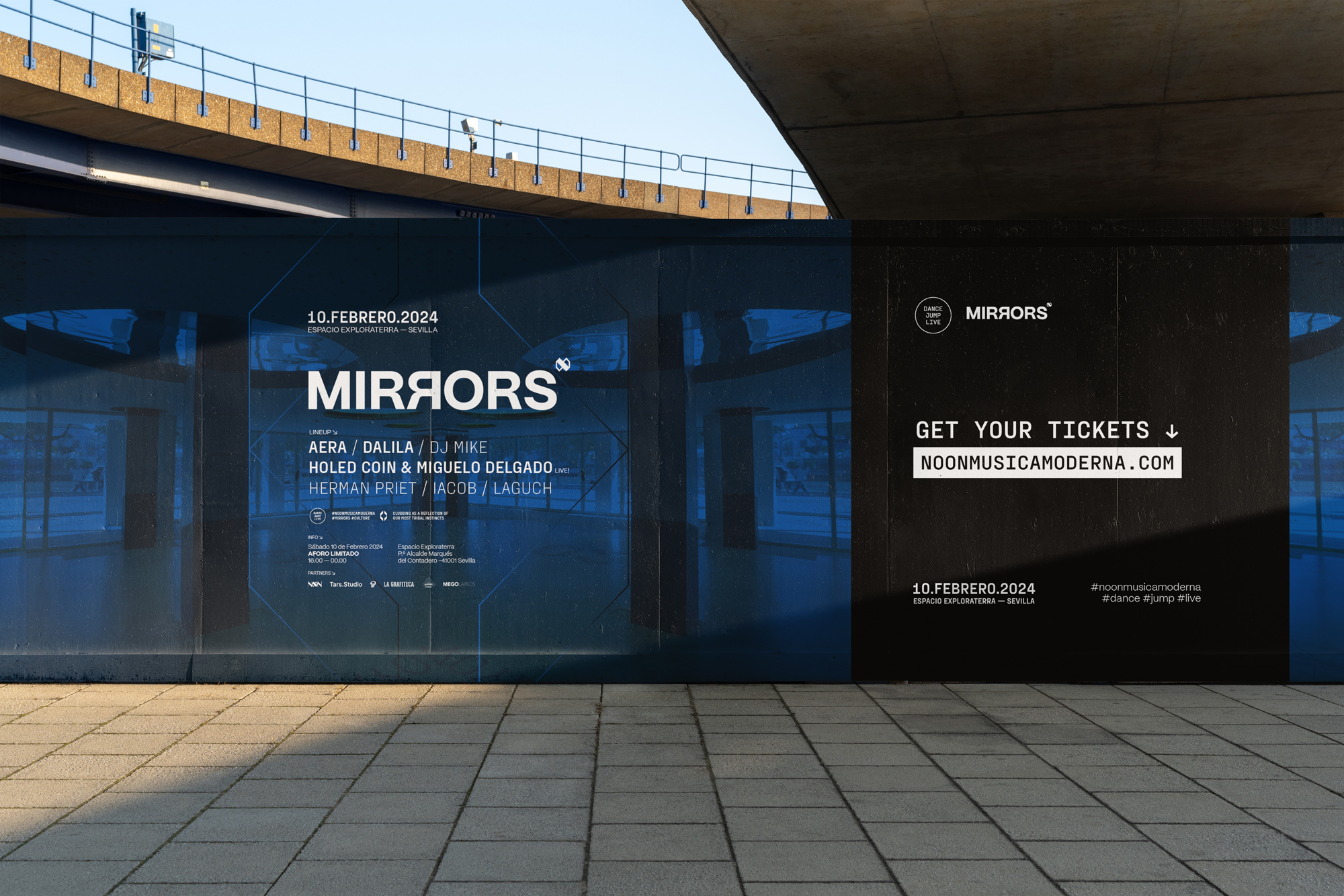
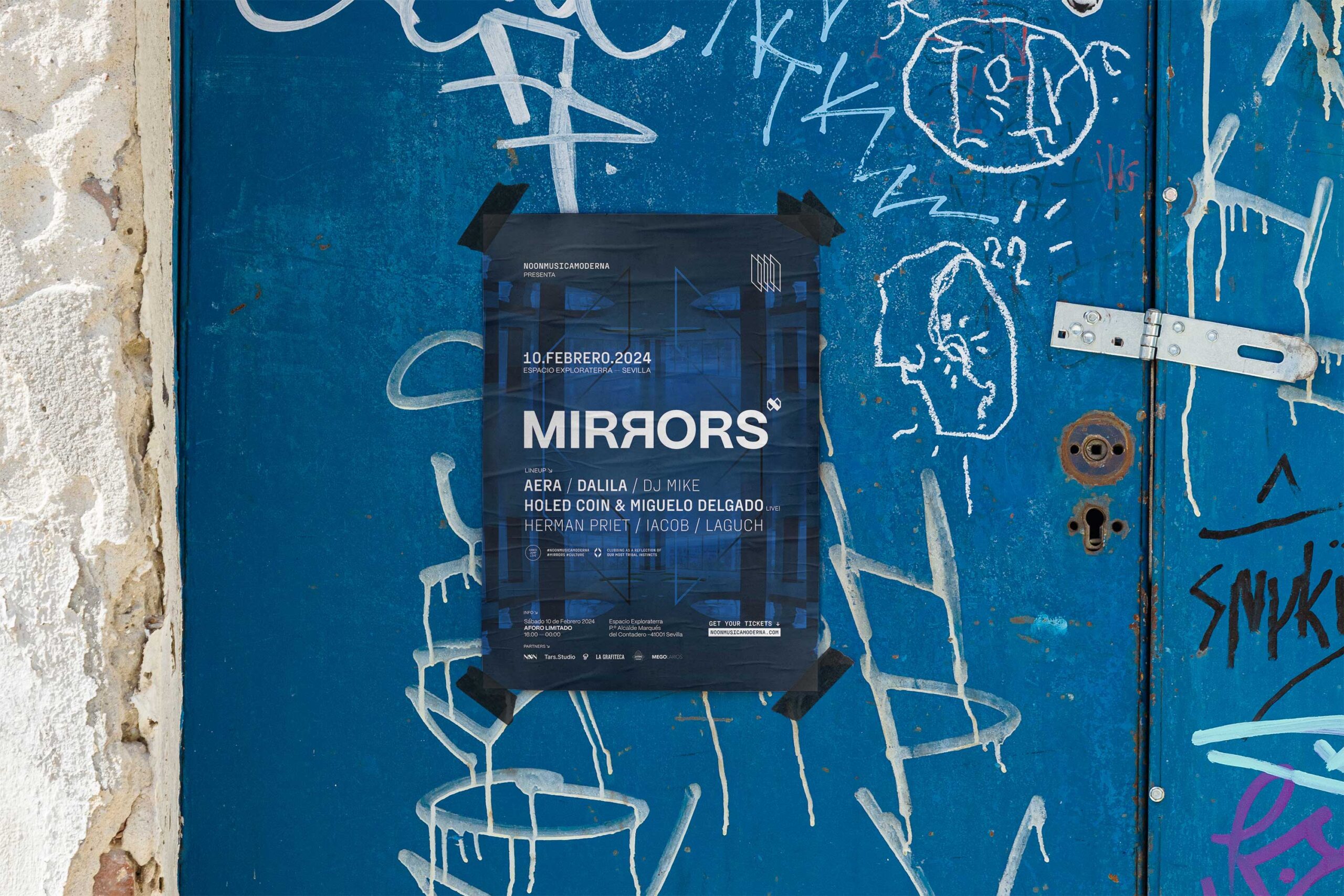
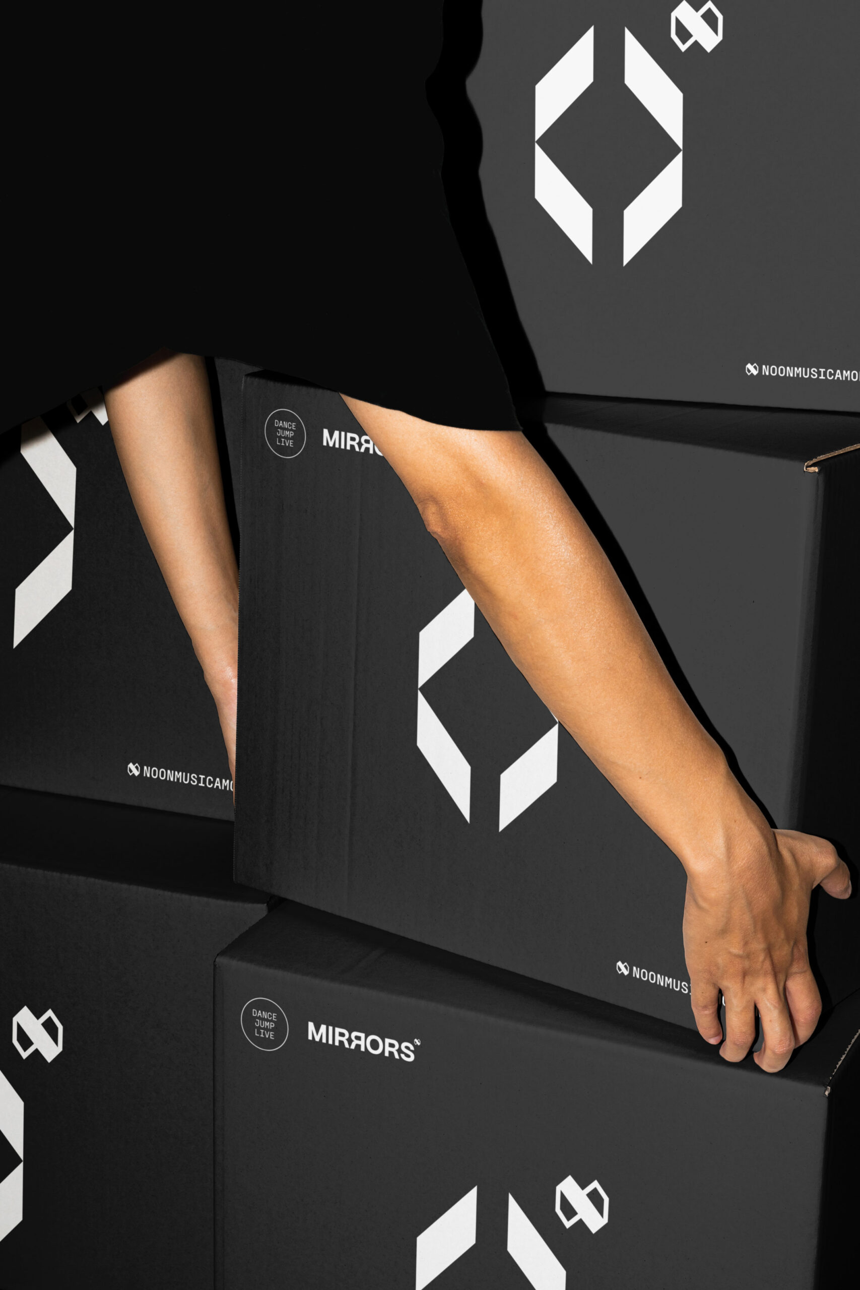
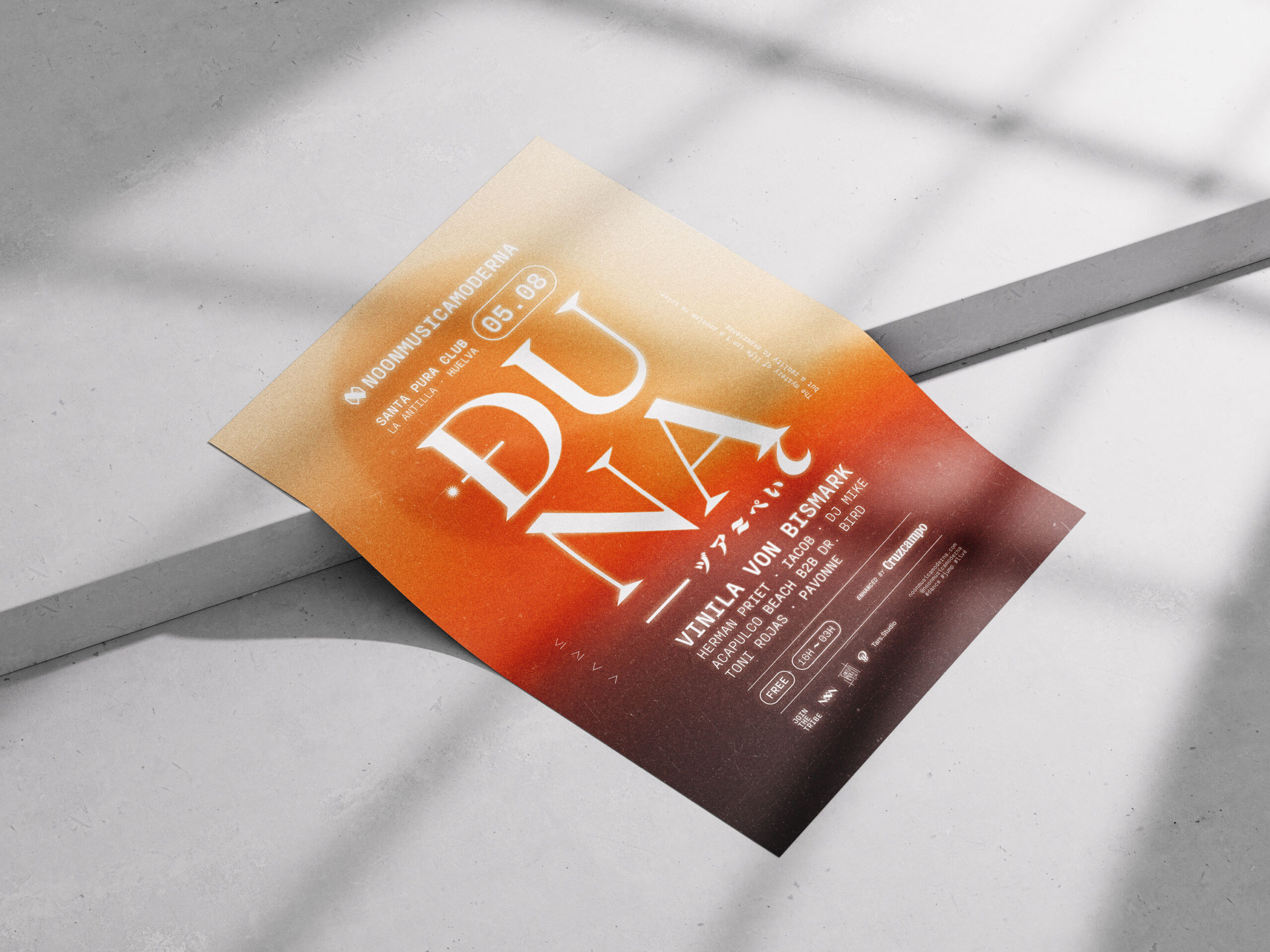
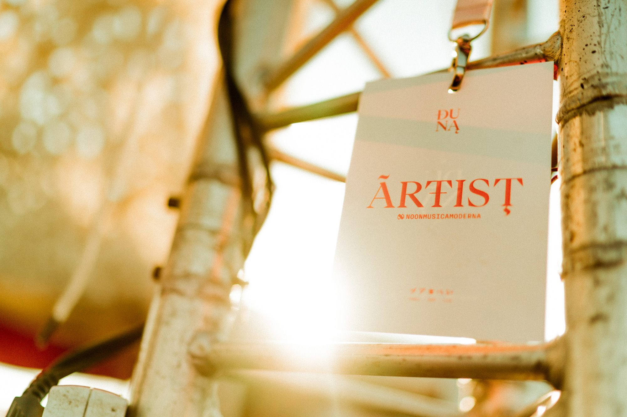
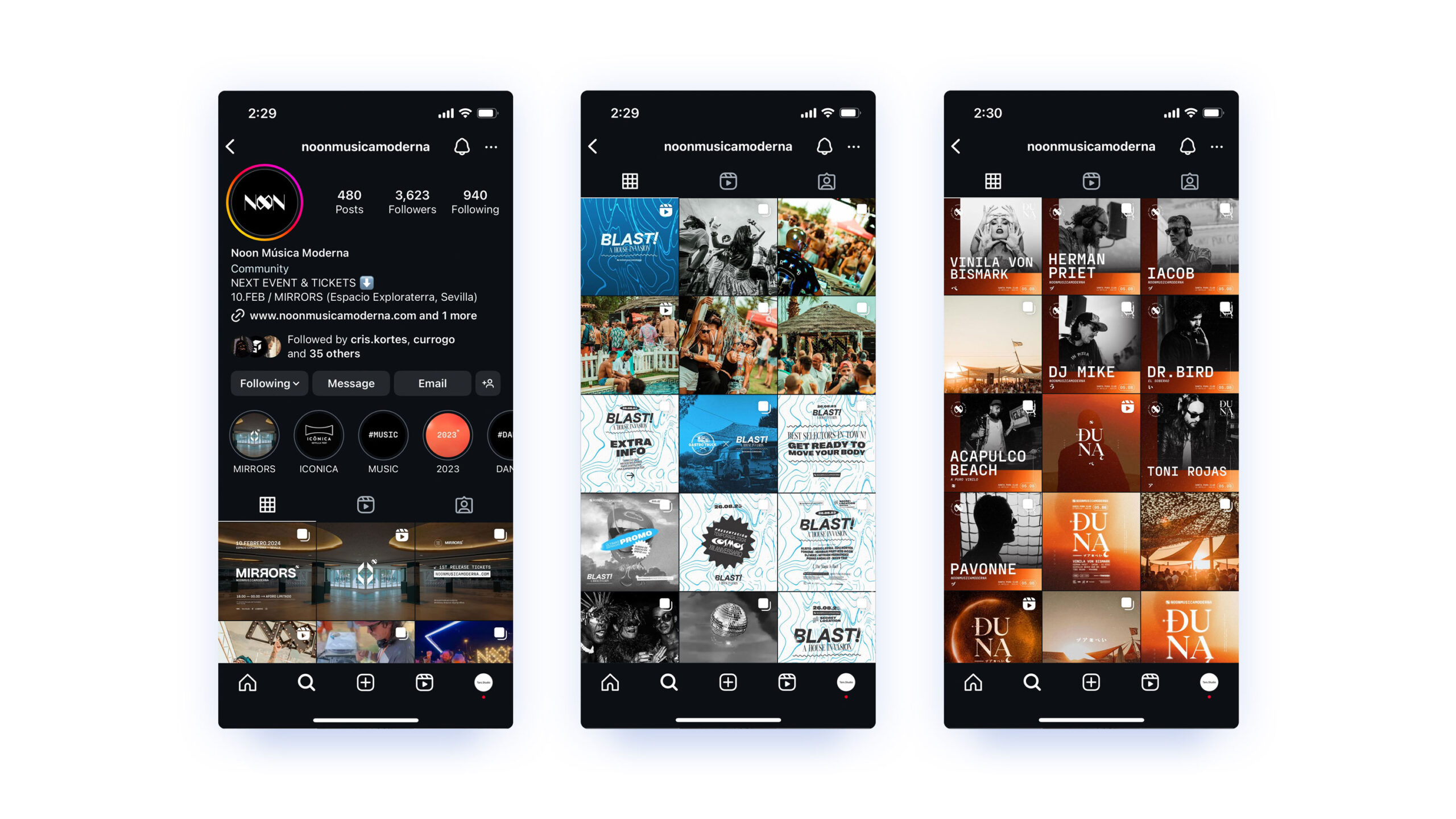
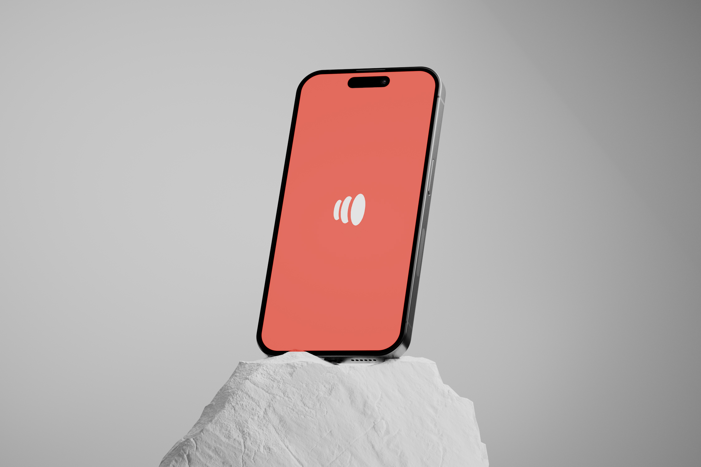
The project consisted of transforming the logotype through the application of a new, more modern, and more direct typography, the addition of the color “Sunset Accent” and the development of a rich graphic universe (both in terms of visual and photographic resources), as well as its application to a series of pieces that include everything from printed materials to graphic advertising, the website, associated brands, physical spaces, merchandising, motion graphics, etc