THE PROJECT
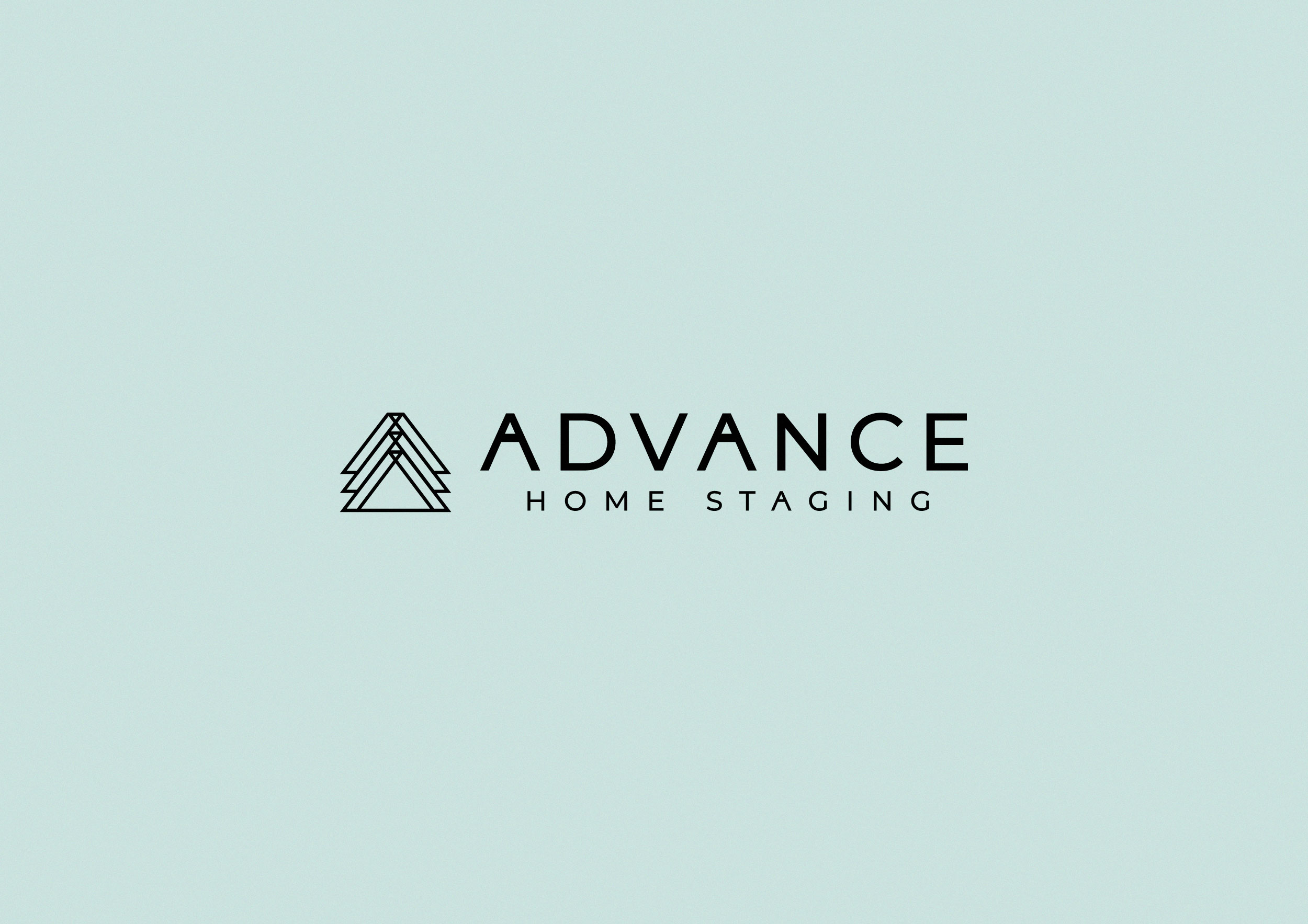
We were asked to design an identity for a new home staging company
that offers occupied, vacant, and realtor staging services in the real
estate market.
The logo mark idea was to merge a house roof and an arrow shape with the letter A from the naming. The Sea Salt color represents
the vision and kindness in the company work plus its Florida skies based
vibe.
![](https://tars.studio/wp-content/uploads/2024/02/ADVANCElogo2-scaled.jpg)
![](https://tars.studio/wp-content/uploads/2024/02/ADVANCElogo.jpg)
![](https://tars.studio/wp-content/uploads/2024/02/ADVANCE-A5_Leaflet_Mockup_4-scaled.jpg)
![](https://tars.studio/wp-content/uploads/2024/02/ADVANCE-Free_Notepad_Mockup_1-scaled.jpg)
![](https://tars.studio/wp-content/uploads/2024/02/minh-pham-OtXADkUh3-I-unsplash-scaled.jpg)
![](https://tars.studio/wp-content/uploads/2024/02/minh-pham-7pCFUybP_P8-unsplash-scaled.jpg)
![](https://tars.studio/wp-content/uploads/2018/11/jean-philippe-delberghe-Ry9WBo3qmoc-unsplash-scaled.jpg)
![](https://tars.studio/wp-content/uploads/2024/02/ADVANCE-Horizontal_DL_Flyer_Mockup-scaled.jpg)